How to make a pitch deck
A practical guide to building a pitch deck step by step: from defining the audience and story to structuring the slides, improving the design and avoiding common mistakes.
A strong pitch deck does more than put business information into slides. It gives the audience a clear path through the idea: what the problem is, why the solution matters, what evidence supports the opportunity, and what should happen next. If you already understand what a pitch deck is, the next challenge is turning that understanding into a deck that is focused, easy to follow and convincing.
This guide explains how to make a pitch deck step by step, how to build a practical pitch deck structure, how to design individual slides, and which common pitch deck mistakes can weaken an otherwise strong story.
1. Before you start: define the audience and goal
Before opening PowerPoint or choosing a template, decide who the deck is for and what you want that audience to do. An investor, potential client, partner and internal leadership team will not evaluate the same information in the same way.
For an investor pitch, the audience will usually want to understand the opportunity, market, traction, business model, team and funding ask. A partnership or sales-focused pitch may put more emphasis on the customer problem, solution, value and next step. The purpose of the deck should determine what receives the most attention.
A useful starting question: if the audience remembers only three things after seeing the deck, what should those three things be? Those answers become the foundation of the story.
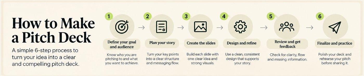
2. How to make a pitch deck step by step
- Define the goal and audienceBe clear about who you are pitching to and what outcome you want: a meeting, investment discussion, partnership, sale or internal approval.
- Outline the story before designingWrite the main sections as simple slide titles. Read them in order: the titles should already form a logical story before you add charts, screenshots or decoration.
- Build each slide around one main messageEach slide should have a reason to exist. Use a clear headline, then support it with the most relevant proof point: a number, chart, product image, customer example or short explanation.
- Design and refineUse a consistent visual system for typography, spacing, colours, charts and imagery. Design should make the message easier to understand rather than compete with it.
- Review with fresh eyesAsk someone who is not deeply involved in the business to review the deck. If they cannot explain the opportunity back to you, the story may still be too complicated.
- Finalise and practiseProofread the deck, test it on the screen or device you will use, prepare for likely questions and rehearse the presentation out loud.
3. Pitch deck structure: what slides should you include?
There is no single pitch deck structure that every company must follow. However, a familiar sequence helps the audience understand the story without having to work out where the important information is hidden.
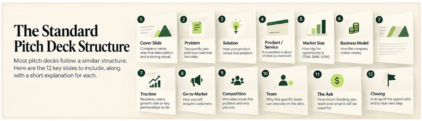
- Cover — Company name, a concise description and a strong opening visual.
- Problem — The specific problem or pain point you are addressing.
- Solution — How your product, service or idea solves that problem.
- Product / service — Show what you have built or what the audience is being asked to believe in.
- Market opportunity — Explain the size and relevance of the opportunity using credible data where available.
- Business model — Show how the business makes or plans to make money.
- Traction — Use relevant evidence such as customers, revenue, growth, pilots, partnerships or usage.
- Go-to-market — Explain how you plan to reach and acquire customers.
- Competition — Show the alternatives and explain where your offer is different.
- Team — Introduce the people who are particularly relevant to executing the plan.
- The ask — State clearly what you are asking for and, for fundraising, how the capital is expected to be used.
- Closing — Reinforce the opportunity and give the audience a clear next step.
4. How to design each pitch deck slide
A good pitch deck slide should be understandable quickly. That does not mean every slide must be minimal or look identical; it means the visual hierarchy should make the main point obvious.
- Lead with the message, not the topic. Instead of a headline such as “Market”, use a headline that communicates the takeaway the audience should understand.
- Keep one primary idea per slide. If a slide is trying to prove three unrelated points, split it or decide which point matters most.
- Use evidence visually. Charts, product screenshots, timelines, customer examples and simple diagrams can make evidence easier to process than a paragraph.
- Keep the system consistent. Typography, spacing, chart styling and colour use should feel like parts of one presentation.
- Design for the way the deck will be used. A live presentation can rely more on the speaker. An emailed reading version may need slightly more context on the slide.
5. Common pitch deck mistakes

- Too much information. Trying to fit every detail into the core deck makes the story harder to follow. Move secondary evidence to an appendix where appropriate.
- A vague problem. If the audience does not clearly understand the problem, the solution has nothing solid to respond to.
- Claims without evidence. Replace broad adjectives with relevant proof wherever possible. A specific metric or customer example is usually stronger than saying the company is “growing fast”.
- No clear ask. The audience should understand what you want from them and what the next step is.
- Weak or missing go-to-market logic. A large market is not enough on its own. Explain how customers will actually be reached.
- Ignoring competition. Every problem has alternatives, including doing nothing. A useful competition slide shows awareness of those alternatives rather than pretending they do not exist.
- Inconsistent design. Mismatched typography, spacing, charts and colours can make a deck feel assembled rather than intentionally designed.
- Reading the slides word for word. The deck should support the presentation. It should not become a script projected onto the screen.
6. Final pitch deck checklist
- Is the audience and purpose clear?
- Can the story be understood from the slide headlines alone?
- Does each slide communicate one primary message?
- Are important claims supported by relevant evidence?
- Is the problem–solution connection easy to understand?
- Are market, business model, traction and go-to-market explained where relevant?
- Is the ask or next step clear?
- Are fonts, colours, charts and spacing consistent?
- Has the deck been proofread and tested in presentation mode?
- Can you present it confidently without reading every word from the slides?
Frequently asked questions
How do you start making a pitch deck?
Start with the audience and objective, then outline the story as slide titles before designing. This keeps the narrative focused before visual decisions are introduced.
What is the best pitch deck structure?
A common structure moves from problem and solution through product, market, business model, traction, go-to-market, competition and team, before ending with the ask and a clear closing.
How many slides should a pitch deck have?
There is no universal number. The core deck should be as long as necessary to tell the essential story clearly without turning into a full business plan. Many investor decks are kept relatively concise, with supporting detail placed in an appendix.
What is the biggest pitch deck mistake?
One of the most damaging mistakes is lack of focus: too many messages, too much text or an unclear ask can make a strong business difficult to understand.
Should a pitch deck be designed differently for email and live presentation?
Often, yes. A live deck can rely more on spoken explanation, while a reading version may need enough context to make sense without the presenter.
From structure to a stronger presentation
Making a pitch deck is a process of editing as much as creating. The strongest version is rarely the one with the most information. It is the one that helps the audience understand the opportunity quickly, see the evidence behind it, and know what should happen next.
Once the structure and content are working, design can strengthen the hierarchy, clarify complex information and give the presentation a consistent visual language. That is where a rough collection of slides starts to become a coherent pitch.
The structure above is the skeleton; the slides still have to carry it. As a pitch deck design agency we have built investor, startup and client decks since 2003, in as little as two hours. Not sure if your current deck is landing the way it should? Send us three slides and we'll send them back fixed, free.
Pitch deck design, examples & redesign
How to improve the visual hierarchy, clarity and consistency of a pitch deck, with practical examples and before-and-after redesign principles.
Missed week 1? Start with What is a pitch deck?
This is a PixelFaerie guide based on our perspective and experience.
Not sure if your deck is landing the way it should?
Send us 3 slides. We'll send them back fixed, consistent and fully editable within two business days. Free, no obligation, and you keep the files. Or talk to us about the whole deck.