Pitch deck design
A strong pitch deck needs more than good content. Design helps your message land: the right visuals, layout, typography and data presentation make the story easier to understand and more convincing.
A strong pitch deck needs more than good content. The story may be convincing, the market opportunity may be real and the numbers may be strong, but if the slides are difficult to scan, visually inconsistent or overloaded with information, the audience has to work harder to understand the message.
Good pitch deck design reduces that friction. It creates hierarchy, gives important information room to breathe and helps the audience see what matters first. This guide looks at practical design principles, pitch deck examples of how different slides can work, and how a pitch deck redesign can turn a cluttered presentation into a clearer and more coherent story.
1. What is good pitch deck design?
Good pitch deck design is not about making every slide decorative. Its job is to support the story. The audience should be able to identify the main message of a slide quickly, understand the evidence behind it, and move through the presentation without being distracted by unnecessary visual complexity.
A well-designed deck is usually clear, consistent, readable, relevant and professional. Those qualities do not require every slide to look the same. They require a visual system that makes different types of information feel as though they belong to the same story.
2. Key design principles for pitch decks
These principles help you create slides that are clear, focused and visually consistent.
- Visual hierarchy — Use size, contrast, position and spacing to show what the audience should notice first.
- Typography — Choose a small, consistent type system. Headings, body copy, labels and data should have clearly different roles.
- Colour — Use a limited palette that supports the brand. Accent colours work best reserved for real emphasis.
- Layout & white space — Do not fill every available area. White space separates ideas and improves scanning.
- Imagery & icons — Use visuals because they communicate something useful, not because an empty area needs decoration.
- Data visualisation — Charts should make the conclusion easier to see. Remove unnecessary labels and complexity.
Good design makes the content easier to understand, not harder. The audience should be able to see the main message within a few seconds.
A well-designed pitch deck is typically:
- Clear: focuses on the key message on each slide
- Consistent: uses a unified visual style throughout
- Readable: uses clean typography and a clear layout
- Relevant: uses visuals that support the story
- Professional: builds trust and confidence
3. Before and after: what a pitch deck redesign changes
Pitch deck redesign is not simply a visual refresh. The strongest redesigns improve the way information is organised and understood. That can mean rewriting a headline, reducing copy, separating ideas, turning numbers into a chart or changing the order in which information appears.
Imagine a market opportunity slide containing a paragraph of explanation, five bullet points and several statistics with equal visual weight. A redesign might replace the paragraph with one clear takeaway, promote two important numbers, use a simple chart to show growth and move secondary detail into a supporting note or appendix.
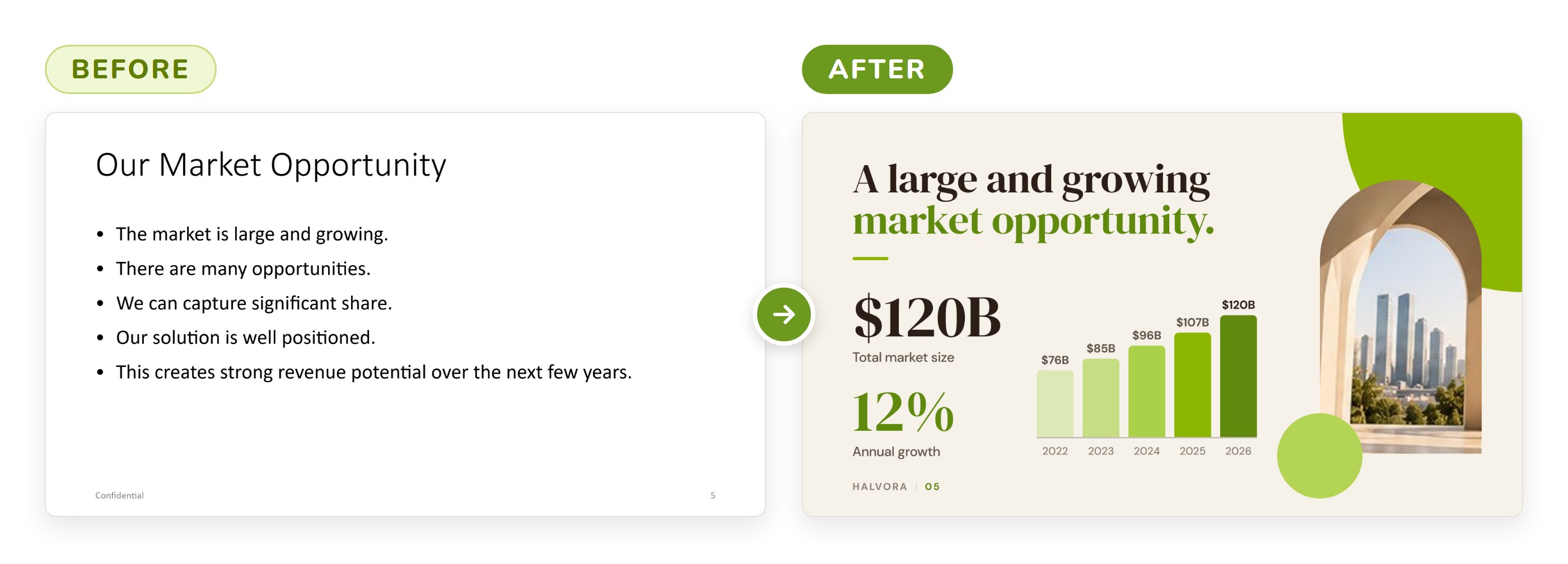
The example slides in this article are illustrative. The company, names and figures are fictional.
What changed?
- Replaced long bullet points with a clear headline and key numbers
- Used a simple chart to show growth visually
- Added a relevant image to create visual interest
- Cleaner layout and more focused message
The underlying facts have not changed. What changes is the audience's ability to see the argument. This is why a useful before-and-after comparison should show more than a prettier slide: it should demonstrate better hierarchy, focus and communication.
4. Pitch deck examples: how different slides can work
There is no single visual template that every pitch deck should copy. A cover slide, problem slide, solution slide and traction slide perform different jobs, so the design should respond to the information on each slide.
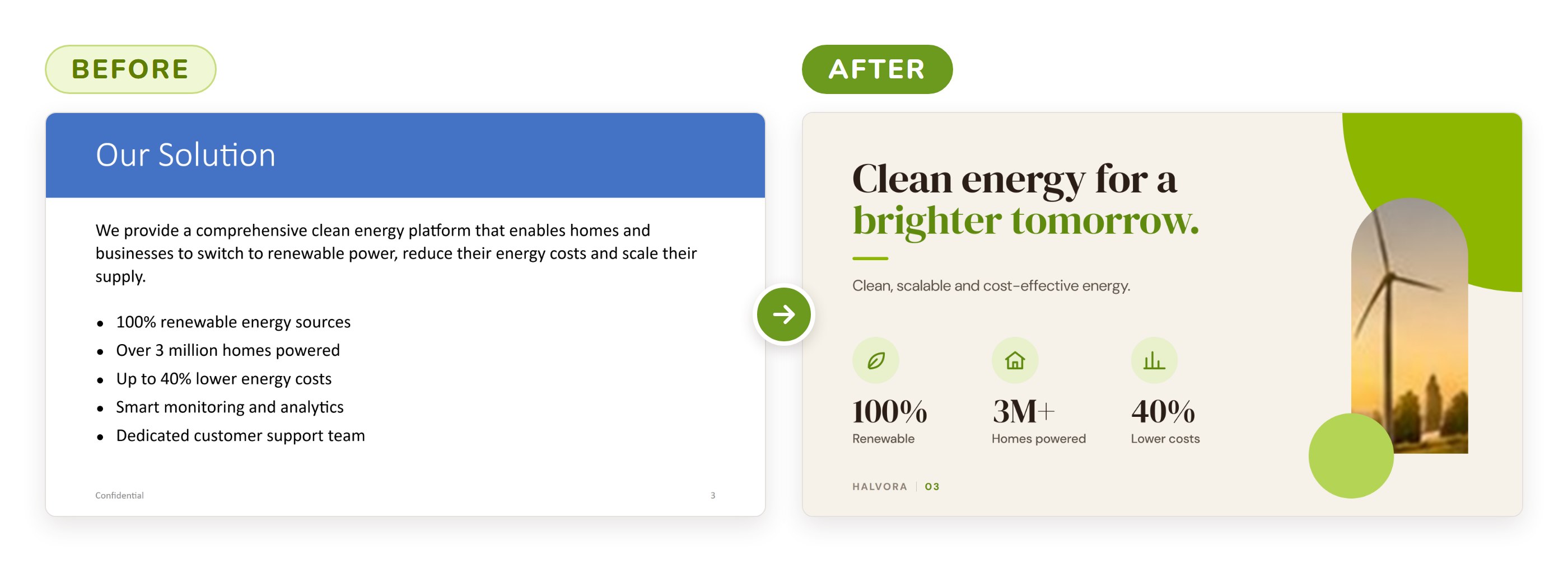
What changed?
- Replaced a dense feature list with a clear, benefit-led headline
- Grouped benefits into three scannable icon points
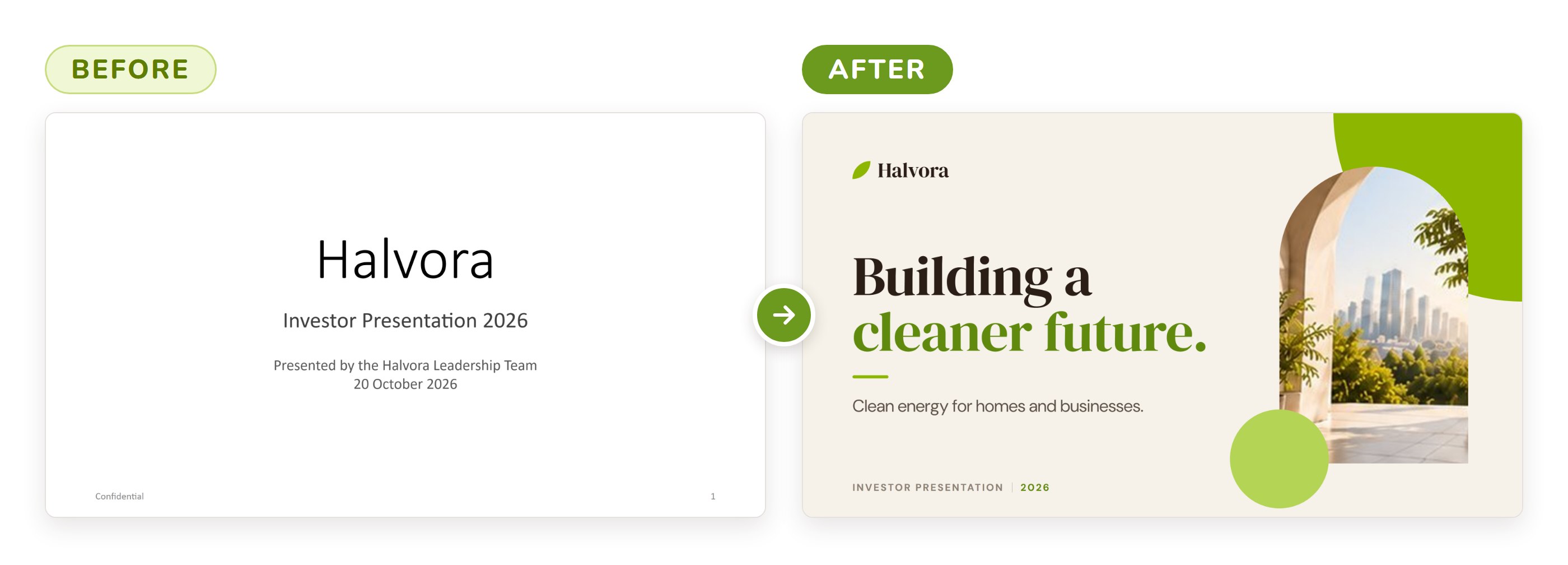
- Cover slide. Keep the opening focused. A company name, concise positioning statement and one strong visual are often enough to establish the tone.
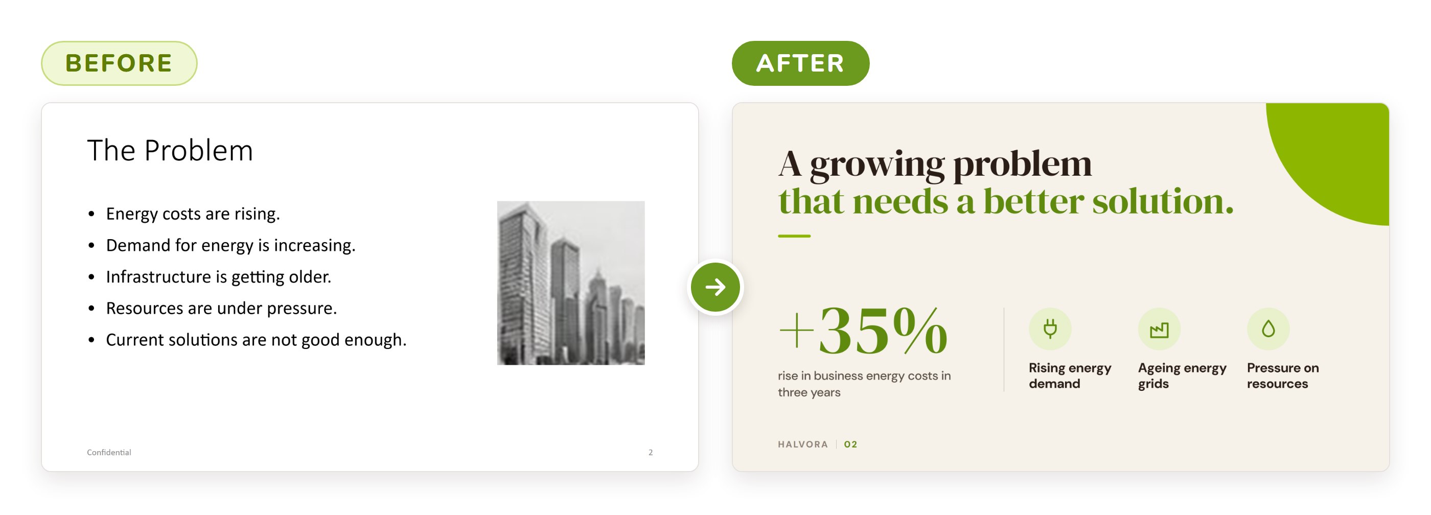
- Problem slide. Make the problem specific. A short statement supported by one relevant statistic, customer insight or visual is stronger than a long explanation.
- Solution slide. Show what changes because of the product or service. A product image, simple workflow or three clear benefits can help the audience understand the solution quickly.
- Market slide. Lead with the conclusion rather than a collection of market-size numbers. Explain what the numbers mean for the opportunity.
- Traction slide. Prioritise evidence. Revenue, customer growth, usage, pilots or partnerships should be easy to identify and compare.
- Team slide. Focus on the people and experience that are relevant to executing this particular plan. Avoid turning the slide into a collection of full CVs.
5. Common pitch deck design mistakes
- Too much text — Slides that look like documents are difficult to scan during a presentation. Keep the core message visible.
- Unclear message — If the key point is not obvious, the audience may miss the main takeaway.
- Lack of focus — Several competing messages on one slide dilute the argument. Decide what the slide needs to prove.
- Inconsistent style — Changing fonts, colours, chart styles or spacing from slide to slide makes the deck feel assembled rather than designed.
- Complex charts — A chart can contain accurate data and still communicate poorly. Simplify the chart or change the format.
- Low-quality visuals — Generic or low-resolution images weaken credibility. Use visuals that are relevant and sharp.
A deck should also reflect how it will be used. A live investor pitch, an emailed reading deck and a partner presentation may need different levels of detail.
6. When does a pitch deck need a redesign?
A redesign can be useful when the business story is sound but the presentation no longer reflects it clearly. This often happens when a deck has been edited by several people over time, when new data has been added without reconsidering the layout, or when an early-stage deck needs to become more polished for a more important audience.
Signs that a deck may need a redesign include inconsistent layouts, slides with no obvious focal point, charts that require explanation before they make sense, long blocks of text, outdated visuals, or a mismatch between the quality of the business and the quality of the presentation.
Worth remembering: redesign should preserve useful content while improving how it is communicated. In some cases the best design decision is not adding something new, but removing what the audience does not need.
7. Pitch deck design checklist
- Does every slide have one clear primary message?
- Can the main takeaway be understood quickly?
- Are headlines specific rather than generic labels?
- Is typography consistent across the deck?
- Is the colour palette controlled and purposeful?
- Is there enough white space around important content?
- Are charts simple enough to understand without lengthy explanation?
- Are images and icons relevant and high quality?
- Do similar slide types use consistent layouts?
- Does the deck feel appropriate for the audience and context?
- Have unnecessary details been moved to an appendix where appropriate?
- Does the final presentation look like one coherent visual system?
Frequently asked questions
What makes a good pitch deck design?
Good pitch deck design makes the story easier to understand. It uses clear hierarchy, consistent typography and colour, purposeful visuals and enough space to keep the audience focused on the main message.
Should every pitch deck use the same design style?
No. The visual system should reflect the company, audience and purpose. Consistency within the deck matters more than copying a particular aesthetic.
What is pitch deck redesign?
Pitch deck redesign is the process of improving an existing presentation's hierarchy, layout, typography, charts, imagery and overall consistency while preserving or refining the underlying story.
Can good design fix weak pitch deck content?
No. Design can make strong content clearer and more persuasive, but it cannot replace a weak proposition, unsupported claims or missing evidence.
Should an investor pitch deck be highly visual?
It should be visually clear, but not visual for its own sake. The right balance depends on the information being communicated and whether the deck will be presented live or read independently.
From a working deck to a designed story
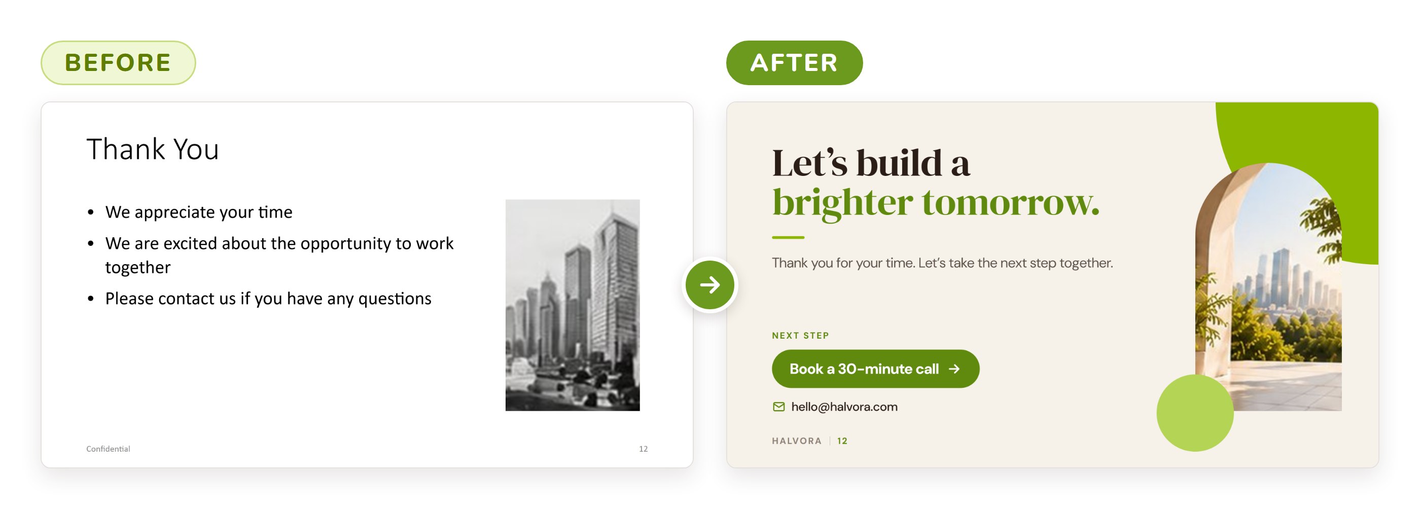
What changed?
- More engaging and forward-looking headline instead of a simple “Thank You”
- Relevant, high-quality image that matches the overall design
- Clear call to action that encourages the next step
- Cleaner, more modern layout
A pitch deck redesign works best when content and design are treated as part of the same communication problem. Clearer headlines, stronger hierarchy, better charts and more disciplined layouts can help the audience understand the business without changing the underlying facts.
The goal is not to make every slide impressive in isolation. It is to make the complete deck feel deliberate, coherent and easy to follow from the opening slide to the final ask.
As a pitch deck design agency we have built investor, startup and client decks since 2003, in as little as two hours. Not sure if your current deck is landing the way it should? Send us three slides and we'll send them back fixed, free.
How much does pitch deck design cost?
We'll look at the factors that influence presentation design pricing, different ways to buy design support, and how to think about cost when planning a pitch deck project.
Missed week 2? Read How to make a pitch deck, or start with week 1, What is a pitch deck?
This is a PixelFaerie guide based on our perspective and experience. The example slides are illustrative; the company, names and figures shown are fictional.
Not sure if your deck is landing the way it should?
Send us 3 slides. We'll send them back fixed, consistent and fully editable within two business days. Free, no obligation, and you keep the files. Or talk to us about the whole deck.